I created a 2 column layout block, gave the columns block a CSS class of .first-col-2-3
and added this CSS to my theme:
.first-col-2-3 > div:nth-child(1) {background:red;width:67%!important;}

.first-col-2-3:nth-child(2) {width:33%!important;}
The result is that the columns stay 50% / 50% width.
But the first one does get a red background.
So the correct column is targeted, yet the width property isn’t changing to make the two columms 67% and 33% respectively.
How do I make the column widths change?
I see a way to add a CSS class to the paragraph within each column but that doesn’t work either. Any ideas / solutions? Thank you!
You can add a 2 column block layout where 1 block takes up 2 thirds in the block editor using the UI. Adding CSS classes to achieve this is highly unusual and unnecessary
When you add a column block it asks you:
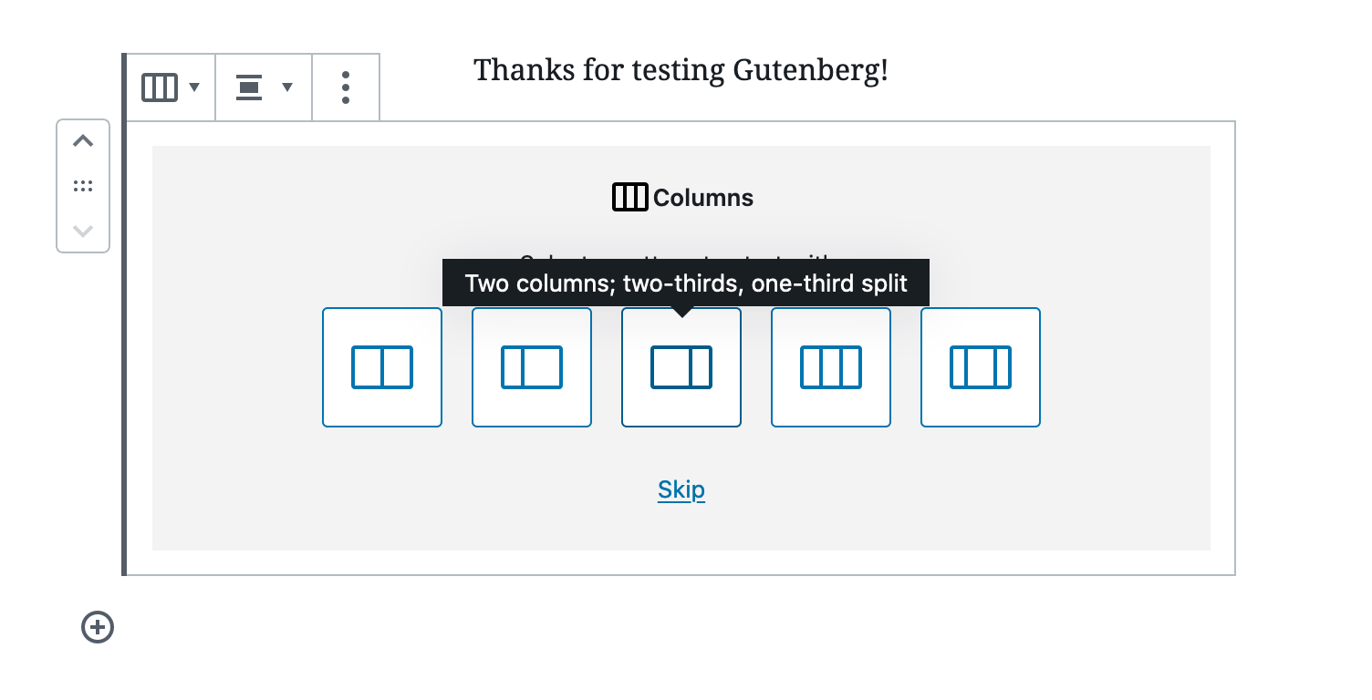
Resulting in column blocks spaced for thirds:
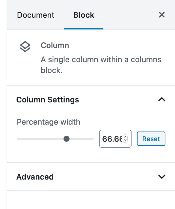
Each block has a percentage width in the block settings:
If you wanted to use the CSS classes from your theme you have several options:
- Build a custom columns block
- Add CSS classes to the column blocks, completely override or remove the block CSS and add in your own
It appears you tried to do the latter, and ran into a 100% pure CSS issue, CSS questions are best asked on stackoverflow (they’re offtopic on WPSE as they aren’t WordPress questions)