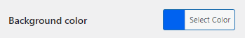
With wpColorPicker available in color-picker.min.js, I was able to easily create color fields which simply display the color:
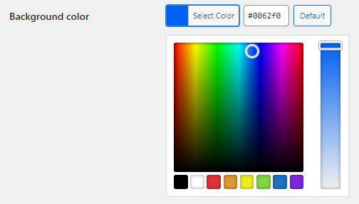
When you click the field, a color picker appears:
Now I want to do the same with Gutenberg components. However, I cannot find the exact replacement for wpColorPicker:
ColorPickerfrom@wordpress/componentsis the picker itself, where the user is invited to choose a color. It doesn’t seem to implement the “show” state. It’s not a full-fledged form control.ColorIndicatorfrom@wordpress/componentsonly shows a color.ColorPalettefrom@wordpress/componentsdoes too much. Using the palette with an empty color set does not work either, it was not designed for this use case.PanelColorSettingsandwithColorsfrom@wordpress/block-editorare even higher level.- Using the Storybook’s stories of the Gutenberg project, I can see that the latest
ColorPalettedoes what I’m looking for, but it doesn’t behave that way in WordPress 5.8.1.

There is an obvious way to get the job done: write a ColorControl component based on ColorIndicator, ColorPicker and Dropdown, or simply steal from the latest ColorPalette.
But I’m wondering if a ready-to-use component is already available.
1 Answer
I ended up implementing my own ColorControl. I’m not satisfied with this solution and I don’t advice you to follow this route blindly. However, if you want to get the job done and don’t want to spend two hours on something that might not exist as I did, here you go.
Install two extra packages:
npm install styled-components colord
The code:
import React from 'react'

const {
  BaseControl,
  Dropdown,
  ColorPicker,
  Button
} = wp.components;

import styled from'styled-components';
import { colord } from 'colord';

const DropWrapper = styled.div`
  margin-top: 8px;
`;

const ColorButton = styled(Button)`
  background-color: ${props => props.value};
  color: ${props => colord(props.value).isLight() ? '#1e1e1e' : '#fff'};
  min-width: 150px;
`;

const ColorControl = (props) => (
  <BaseControl
    label={props.label}
  >
    <DropWrapper>
      <Dropdown
        renderContent={() => (
          <ColorPicker
            color={props.value}
            onChangeComplete={color => props.onChange(color.hex)}
          />
        )}
        renderToggle={ ( { isOpen, onToggle } ) => (
          <ColorButton
            aria-expanded={ isOpen }
            aria-haspopup="true"
            onClick={ onToggle }
            aria-label={ `${props.label} color picker` }
            value={ props.value }
          >
            { props.value }
          </ColorButton>
        ) }
      />
    </DropWrapper>
  </BaseControl>
);

export default ColorControl;
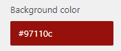
The field:
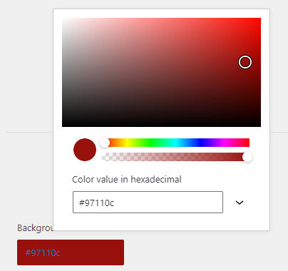
When you click it: